Leopoldo Peron

Leopoldo Peron

Art direction, brands and motion.

Over 20 years of creative career, developing brands, campaigns and audiovisual experiences for Brazilian and international clients.

Ideas that sell. Memorable brands.

About

Every brand has something to say. I give it shape, color and motion to be heard. From identity to stage, from film to packaging, every project is born to move people, to be remembered and to sell.

  • International experience6 ADAMA events in 5 countries (Hungary, Italy, Malta, Cyprus and Spain), from 2023 to 2026.
  • ClientsADAMA, OralSin, Hydro, Orthodontic, Fish King, Aura and Brazilian Pet Foods.
  • CareerI have worked at agencies and production companies such as JWT and Vivas Comunicação, and I have been at London Creative since 2018.
  • Brands servedHSBC, O Boticário, Avon, Electrolux, Kraft, Bunge, Government of Paraná, Grupo Positivo and Pequeno Príncipe Hospital.
  • Awards and mentionsRecognition throughout my career: iF Design Award, GRPCOM and App Markmídia. London Creative: production company elected Best Video Production Company in Londrina by APP (2017 and 2018).

What I deliver

  • Art directionVisual concept, KV and campaign roll-outs, launches and events, from ADAMA to OralSin.
  • Visual identity and brand booksBrands and visual systems, as in Brazilian Pet Foods, Aura, OrthoEstetic and Fish King.
  • Motion, video and animationFilms, bumpers, openings and Same Day Edit in After Effects and Premiere Pro, as in ADAMA, Hydro and ELO28, plus AI video.
  • Multi-screen and 360° eventsThe whole stage as a single screen and openings in a 360° room, for Orthodontic and ADAMA.
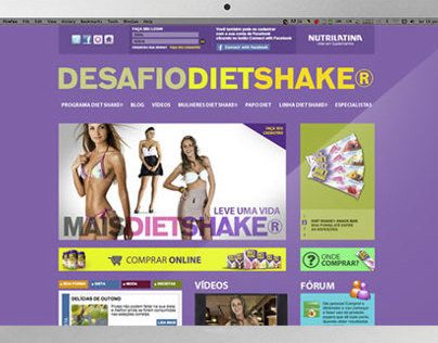
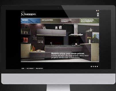
  • Websites and landing pagesBrand website and the Snow movement site for Brazilian Pet Foods, plus campaign and corporate sites such as Desafio Diet Shake and Guararapes.
  • Social media postsPosts and campaigns for social media, as in OrthoEstetic (Dentist's Day and Children's Day), OralSin and Fish King.
  • Banners and campaign piecesKV and roll-outs: banners, roll-ups, flags, backdrops and signage at ADAMA events, plus regional promotional campaigns for Brazilian Pet Foods.
  • Presentations and templatesPresentation templates and animated screens for ADAMA events and Orthodontic conventions, and brand presentations for Brazilian Pet Foods.
  • Packaging and POSPOS display packaging for the launch of 8 Tetra Pak SKUs (Brazilian Pet Foods), Fish King packaging and sales materials.

Tools: Adobe Creative Cloud (Photoshop, Illustrator, InDesign, After Effects and Premiere Pro) and generative AI applied to creation and content.

Shall we talk about your next project?

Tell me the challenge, the deadline and what you need to create.
WhatsApp: +55 41 99911-6261

Banners and campaign pieces · Presentations and templates · Motion and video · Multi-screen and 360° events

ADAMA Global

Six global meetings, five countries and a visual experience of its own for each event.

The 360° room of the Field to Future event, in Milan, with the screen surrounding the audience

6 events in 5 countries, from 2023 to 2026

Context and challenge

Six global ADAMA leadership meetings, in five countries, each with its own theme, KV and objective. The challenge was to create the visual identity and the content of each event (graphic pieces, opening videos, vignettes and presentation templates) for very different screen formats, from multi-screen stages to 360° rooms, with production timelines of about four to five weeks per event, faithfully following ADAMA's brandbook.

Listen, learn, deliver: ADAMA's motto became ours too. We listen, understand what the client needs and deliver.

Main deliverables

Development of the visual concept for each event, graphic pieces, opening videos, bumpers, presentation templates and a complete visual kit.

Credits

Client: ADAMA Global. Concept and execution: Leopoldo Peron, London Creative. Agency: Aura Marketing.

Choose an event to see the concept, the videos and the pieces.

Presentations and animated screens · Motion and video · Multi-screen events

Orthodontic

Conventions where the whole stage becomes a single screen.

Video of Orthodontic
Context and challenge

To move the participants with an enchanting story.

My role

Art direction, motion, editing, visual design.

Idea and solution

Treat the whole stage as a single screen, creating an immersive and memorable atmosphere.

Main deliverables

I created videos, intros, bumpers, presentation screens and animated backgrounds, all synchronized across multiple screens and in the look of the event.

Credits

Client: Orthodontic. Concept and execution: Leopoldo Peron, London Creative.

Visual identity · Packaging · Social media posts · Campaigns

Fish King

From the Kombi van to a restaurant with its own identity: brand, packaging, façade and campaign.

Video of Fish King
Context and challenge

Turn a seafood food truck into a restaurant with a complete identity.

My role

Visual identity and brand.

Idea and solution

Visual appetite, playful elegance and the sea as a language.

Main deliverables

I created the brand and the visual system: logo, pattern, packaging and storefront.

  • Complete identity: logo, pattern and the illustrations of the boat and the sea.
  • Packaging: bag, butter paper and newsprint.
  • Container façade, designed for the park.
  • Menu and images for iFood.
  • Video campaigns.
Credits

Client: Fish King. Brand: Leopoldo Peron. Campaigns: London Creative.

Campaign · Script and art direction · Motion and video

Hydro, Mother Nature

Over a hundred years of history told as pride, origin and sustainability, with Fafá de Belém.

Video of Hydro, Mother Nature
Context and challenge

Connect a global aluminium giant to the roots of Pará, with Fafá de Belém as the voice and presence of the campaign.

My role

Script, art direction and production.

Idea and solution

Fafá de Belém as the voice of origin, and mother nature as the thread running through the brand's story.

Main deliverables

I wrote the script, signed the art direction and took part in production, together with London Creative.

Credits

Client: Hydro. Concept and production: Leopoldo Peron, London Creative. Direction: Lydia Damian.

Visual identity and brand book · Stationery and applications

Aura

The brand of an international marketing, communication and events agency: light, organic and sophisticated.

Aura: business cards with the brand's symbol and pattern
Context and challenge

Turn into a brand what Aura wants to be: exceptional, genuine, engaging and innovative. "What you feel before you notice."

My role

Creation of the brand, the visual universe and the brand book.

Idea and solution

The word Aura comes from Latin and means a light breath, a breeze, a vibration. From the brand comes a symbol that, repeated, rotated and mirrored, becomes a pattern.

Main deliverables

I created the brand and the brand book: concept, tone of voice, palette, typography, construction grid and the applications, from business cards to T-shirts.

  • Logo in versions: symbol, simple signature and signature with tagline.
  • Nine-color palette: four neutrals and five vibrant ones, which can be freely combined.
  • Typography for headlines and a complete family for body text.
  • Organic symbols and patterns created from the symbol.
  • Construction grid, safe zone, minimum sizes and incorrect uses.
  • Applications: corporate stationery, business card, T-shirt and LinkedIn cover.
Credits

Client: Aura Marketing. Brand and visual direction: Leopoldo Peron. Founder: Patrícia Vezozzo.

Palette

Neutrals

  • Terracotta#D8A383organic and sophisticated
  • Misty Lavender#B8ADC8creative subtlety
  • Linen#F5F3EElightness and neutrality
  • Noir#000000presence and elegance

Vibrant

  • Dark Sage#374633balance and nature
  • Lemon#1B7D00vitality and innovation
  • Lime#1BCE00modernity and impact
  • Electric Red#CE123Aenergy and presence
  • Carmin#85123Astrength and passion

Art direction · Video · Launches

Zomo

Art direction and production for launches with their own language.

Video of Zomo
My role

Art direction and production of the launches.

Credits

Client: Zomo. Concept and production: Leopoldo Peron, London Creative.

Motion and video · Script and art direction · Corporate film

A Country Called Agro

A tribute to Brazilian agribusiness and its strength.

Video of A Country Called Agro
Context and challenge

Create a moving film that carries the message of Brazil's agricultural greatness and productivity.

My role

Creation and production of the corporate film.

Main deliverables

We wrote the script and the narrative thread of the story together, four hands, us and the client. Art direction and editing.

Result

It was a success. It earned honorable mentions and even copies plagiarizing our film.

Credits

Client: ADAMA. Concept and execution: Leopoldo Peron, London Creative.

Visual identity and brand book · Website · Packaging and POS · Promotional campaigns

Brazilian Pet Foods

Evolving is natural: the brand stops being just a symbol and becomes a visual system, without losing its essence.

Brazilian Pet Foods: institutional seal “Feeding moments” in blue and gold
Context and challenge

Brazilian grew in structure, portfolio, people and reach. Its brand needed to stop being just a symbol and become a system, after 30 years of history.

The challenge was to conduct an umbrella brand with more than six sub-brands, spread across Brazil and Latin America, like an orchestra that has to sound in tune in every city.

My role

Brand repositioning and evolution: symbol, colors, typography, visual system and brand manual. I also built the brand's website.

Idea and solution

Refine, don't break. The "b" remains the guardian of the essence, and the green and yellow ribbon now embraces the letter: "Feeding moments".

Thirty years on the road and a brand that already knew who it was: the work was not to reinvent it, but to give it a more refined design, worthy of a new message.

Main deliverables

I led the brand repositioning, from "we sell dog food" to "we protect and celebrate the bond between owner and pet", and created the new visual system, from the symbol to the applications, with a brand manual and usage rules.

  • Refined symbol, with more breathing room and the green and yellow ribbon embracing the "b". Monochrome, three solid colors and 3D versions.
  • New rounded typography in upper and lower case.
  • Palette with blue as the base, and green and yellow with more depth.
  • Modular visual system: icons and mosaic, in which each shape carries a meaning of the brand (vitality, technology, care, nutrition).
  • Institutional seal, a stamp of tradition, quality and legacy.
  • Applications: backdrop, mug, hoodie, bag and presentations.
  • Brand manual with the usage rules.
  • Website: brazilianpetfoods.com.br (opens in a new tab).
Result

Delivered system: the new visual system and the brand manual, with standards and usage rules so that design, communication and advertising speak the same language in every format.

Project objectives: a more mature, human identity prepared for packaging, trade marketing and digital presence, with more trust, closeness and emotional value, without losing institutional solidity.

Credits

Client: Brazilian Pet Foods. Concept, art direction and website: Leopoldo Peron.

Palette

Brand colors

  • Navy blue#00007Etrust and solidity
  • Light blue#42B1CC
  • Royal blue#035AA7
  • Sage green#8AAC8Bnutrition
  • Sand#E0C192
  • Yellow#FFD713vitality
  • White#FFFFFF

Social media posts · Video · Pixel art game · Campaign

OralSin

A pixel-art game that turned communication into play, with the look of a platform classic.

Desafio OralSin, pixel art game
My role

Art direction and design.

Idea and solution

Turn communication into a game: the OralSin Challenge got the look of a classic platform game.

Main deliverables

I created the Desafio OralSin pieces, inspired by classic platform games.

  • OralSin Challenge: a pixel art game, with social media posts and weekly videos, until the winning team was announced.
Credits

Client: OralSin. Concept and execution: Leopoldo Peron, London Creative.

Visual identity · Social media posts · Applications in spaces and stationery

OrthoEstetic

A brand that turns a smile into conversation: the speech bubble that smiles.

OrthoEstetic: clinic room with the identity applied to the walls
Context and challenge

For years, the clinic smiled under the flag of a network. When it lowered that flag and began operating under its own name, it needed a smile of its own: new enough to be its own, familiar enough that no one would find it strange.

My role

Creation of the complete visual identity and its applications in the spaces and on social media.

Idea and solution

Smile + talk = a speech bubble with a smile. A simple symbol that becomes a character, an avatar and the clinic's stamp.

Main deliverables

I created the brand and its system: symbol, color panel, applications in the clinic's spaces, stationery and pieces for social media.

  • Symbol concept and brand construction.
  • Color panel and color versions.
  • Spaces: wall, corridor and reception.
  • Folder and printed materials.
  • Social media: Dentist's Day, Children's Day and campaigns.
Credits

Client: OrthoEstetic. Visual identity and art direction: Leopoldo Peron.

Motion and video · Art direction · Product material

Stink bugs, Galil + Magnum

Science and cinema in the same scene: real stink bugs, seen up close.

Video of Stink bugs, Galil + Magnum
My role

Art direction, motion, design.

Idea and solution

Show the product's effect on the real insect, in close-up, instead of just describing it.

Main deliverables

Macro-lens filming of real stink bugs, to record up close how the pest behaves in the presence of the ADAMA product, plus the artwork for the material.

Credits

Client: ADAMA. Concept and execution: Leopoldo Peron, London Creative.

Motion and video · Visual identity · Advertising campaign

SAC do Sorriso

The singer Leonardo answers the phone at OralSin's SAC do Sorriso.

Video of SAC do Sorriso
Context and challenge

Bring the character Leonardo into the clinic's universe, with good taste, a smile on his face and Leonardo's way of charming people.

My role

Art direction, design.

Idea and solution

Put the singer Leonardo, the brand's star, on the other end of the line: customer service with the feel of a show.

Main deliverables

A series of films in which the singer Leonardo answers the OralSin Smile Call Center, with the call center's visual identity. I created the brand, the visual identity and the concept, and worked jointly on the art direction.

Credits

Client: OralSin. Concept and execution: Leopoldo Peron, London Creative.

Motion and video · Visual identity · Advertising campaign

Ana Maria Braga and Leonardo on the call

Ana Maria Braga and Leonardo meet on a video call in the OralSin Challenge.

Video of Ana Maria Braga and Leonardo on the call
Context and challenge

Bring Ana Maria Braga and Leonardo into the universe of the OralSin Challenge, with good taste, a smile on their faces and the way of charming people that only they have.

My role

Art direction, design.

Idea and solution

Bring two popular names together on a video call, like a real conversation.

Main deliverables

Films of the OralSin Challenge with Ana Maria Braga and Leonardo, and the film in which Ana Maria recommends OralSin. I created the visual identity and the concept, and worked jointly on the art direction.

Credits

Client: OralSin. Concept and execution: Leopoldo Peron, London Creative.

Motion and video · Script · AI video

ELO28

Naming, launch, opening and teaser films for Bilfor's arrival in neighborhood 28.

Naming film, ELO28
Context and challenge

ELO28 is a 19-story development, presented at a launch event with more than 500 people.

Bilfor arrived with ELO28's lifestyle in hand and a request that seemed simple: turn that identity into a story. Not just any story, but the story of a development arriving in the neighborhood and the city, with the same excellence with which Bilfor builds its own trajectory. The mission: to make the city fall in love with a new address.

My role

Script, editing and AI image generation.

Idea and solution

“Close to you”: the name and the films place the brand in the neighborhood's daily life. The most special part: an entire song just for ELO28, lyrics and melody, in a rhythm tailor-made for the concept and the style.

Main deliverables

I wrote the scripts, edited the four films and generated part of the images with AI. The films: naming, launch, Bilfor opening and teaser (“Bilfor is arriving in neighborhood 28”).

Result

It was a success. Many units sold right at launch, and a project that enchanted and made history.

Credits

Client: Bilfor. Image capture: London Creative.

Behind-the-scenes stories

Afterwards, it was beautiful to see people humming the chorus around. When a brand becomes a song stuck in your head, it already lives inside people. ELO. Connection. 🎵🎶🎤